Dark Vibrant
Dunkle UI, leuchtende Akzente, Media-Player-Patterns.
P0=0 · MA=0 · Comp 19/25 · LH 0.75
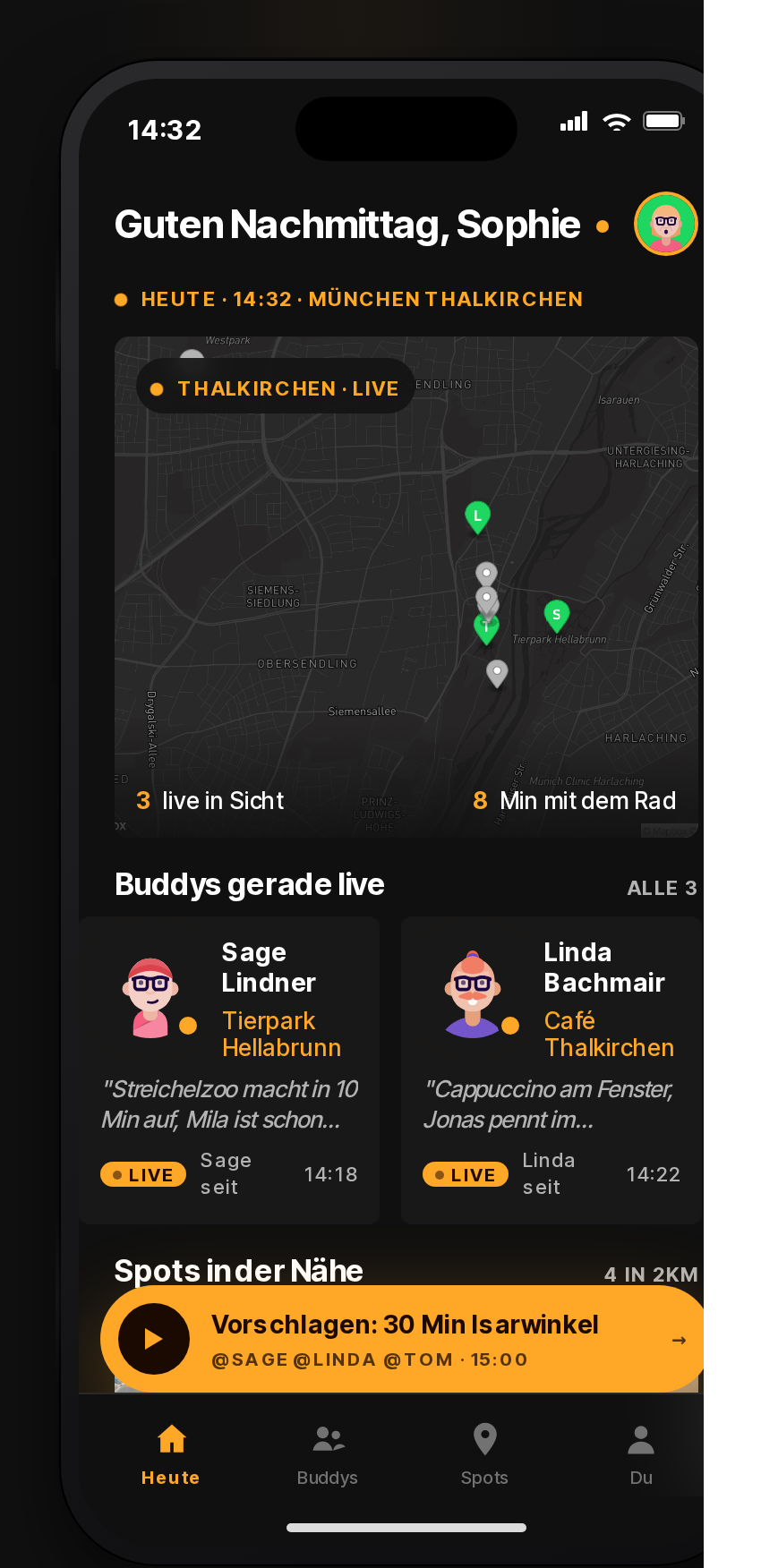
Mockup
Was wurde geprüft? (bf-design Pipeline)
| Gate | Ergebnis |
|---|---|
| Verifier · P0 (Hard-Rules aus Brief) | 0 Verstöße · Profil mobile-app |
| Verifier · P1 (Soft-Rules) | 0 Hinweise |
| Mobile Asserts · P0 (Asset-Contract) | 0 fehlende/falsche Assets |
| Mobile Asserts · P1 | 0 Hinweise |
| Token-Lint · Color Literals | 21 hart codierte Farben |
| Token-Lint · Magic Numbers | 69 undokumentierte Werte |
| Token-Hoist · Auto-Promotion | 18 Farben → Token |
| Axe · A11y-Violations | 3 insgesamt, 0 kritisch |
| ClassA · WCAG-Kontrast | alle Paare bestanden (2 geprüft) |
| ClassA · Touch-Target ≥ 44pt | 0 Verstöße |
| ClassA · Reduced Motion | respektiert |
| Vision Score · Composite (max 25) | 19 (Ziel 22) |
| Vision · Information Density (1–5) | 4 |
| Vision · Visual Hierarchy (1–5) | 4 |
| Vision · Brand Coherence (1–5) | 3 |
| Vision · AI-Slop-Smell (1–5, höher = sauberer) | 4 |
| Vision · Mobile Realism (1–5) | 4 |
| Lighthouse · Performance | 0.75 (Ziel ≥ 0.90) |
| Lighthouse · Accessibility | 1 (Ziel ≥ 0.95) |
| Lighthouse · Best Practices | 0.96 (Ziel ≥ 0.90) |
| Bundle-Size | 1325 KB |
Vision-Critique-Zitat
Greeting hero, dark map card mid, two buddy cards with LIVE pills, amber suggestion bar above the four-tab bottom bar — solid native-iOS skeleton. Amber swap helps but map tiles, type, and card silhouettes still read Spotify-derivative.
Farbpalette
bg-deep
bg-surface
bg-elevated
fg-primary
fg-secondary
fg-tertiary
accent-amber
accent-coral
accent-glow
row-hover
divider
FORBIDDEN-spotify-green
Typografie
| Rolle | Wert |
|---|---|
| display | "Spotify Mix", "Circular Std", "Inter Tight", -apple-system, system-ui, sans-serif |
| display-weight | 700 |
| display-tracking | -0.018em |
| body | "Spotify Mix", "Circular Std", "Inter Tight", -apple-system, system-ui, sans-serif |
| body-weight | 500 |
| small-meta | "Spotify Mix", system-ui, sans-serif |
Spacing
| Step | Wert |
|---|---|
| step-0 | 4px |
| step-1 | 8px |
| step-2 | 12px |
| step-3 | 16px |
| step-4 | 24px |
| step-5 | 32px |
| step-6 | 48px |
Radius
| Element | Wert |
|---|---|
| xs | 4px |
| sm | 6px |
| md | 8px |
| art | 4px |
| circle | 50% |
Schatten
| Tier | Wert |
|---|---|
| row-card | 0 8px 24px rgba(0, 0, 0, 0.5) |
| art-glow | 0 16px 48px rgba(255, 167, 38, 0.32) |
| no-shadow-default | none |
Charakteristische Patterns
- rectangular cover-art tile (square, slight 4px radius)
- row-list pattern: 56px tile + title + subtitle + duration
- round play-FAB in accent-amber, fixed bottom-right
- horizontal scroll shelf for collections (no wrap)
- circle avatar for hosts/artists (40px or 56px)
Anti-Patterns dieser Direktion
- ANY use of Spotify-green #1DB954 (this is the PIVOT — must be amber/coral)
- white background (Spotify is dark-only here)
- drop shadows on rows (use bg-elevated tone shift instead)
- rounded-2xl on cover art (max 4-6px radius)
- Inter as display (must be Circular/Spotify Mix family)